
Goal: Create a personal logo that demonstrates the use of complementary colors.
Complementary colors are two colors that cancel each other out when they are combined. They mix together to create black, gray, or white. Traditionally, the three primary colors are red, yellow, and blue. This chart shows where they sit on a traditional color wheel.
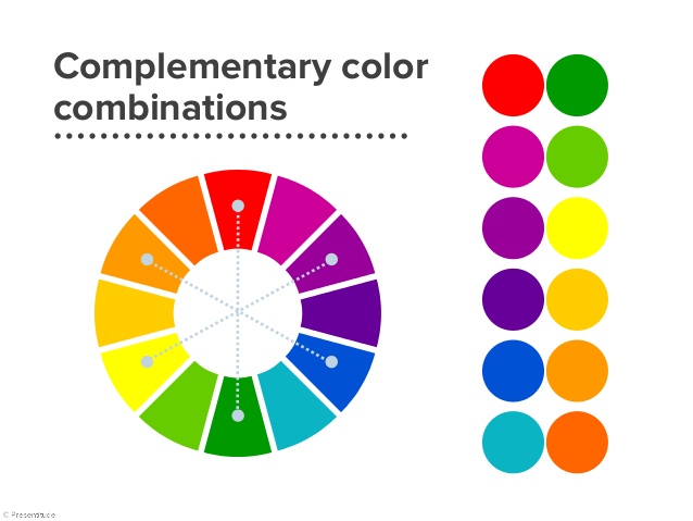
Complementary colors are opposite each other on the color wheel. The complement of each primary color is the mix of the other two primary colors.
Your mission: using only black, white, and two complementary colors, create a logo for yourself. HINT: if you download the chart above, you can use Photoshop’s eyedropper tool to easily sample colors.
Sample logo:
Remember: a logo should be a symbol of whatever it represents. I just used letters (though I did play with the G a little to make it look like a map pin). Some logos have no letters. Some have shapes. Some have objects, or animals, or faces. Whatever you use for your logo, make sure it is unique and representative of you.
FUN BONUS FACTS! (you can skip these for now if they confuse you)
The Red-Yellow-Blue model is the traditional model, and it’s based on mixing pigments. Modern models are based on light and use a Red-Green-Blue model. With light, Red + Green + Blue = White.
And then there’s the CMYK model for printing!
A ton more information about complementary colors can be found on Wikipedia.